

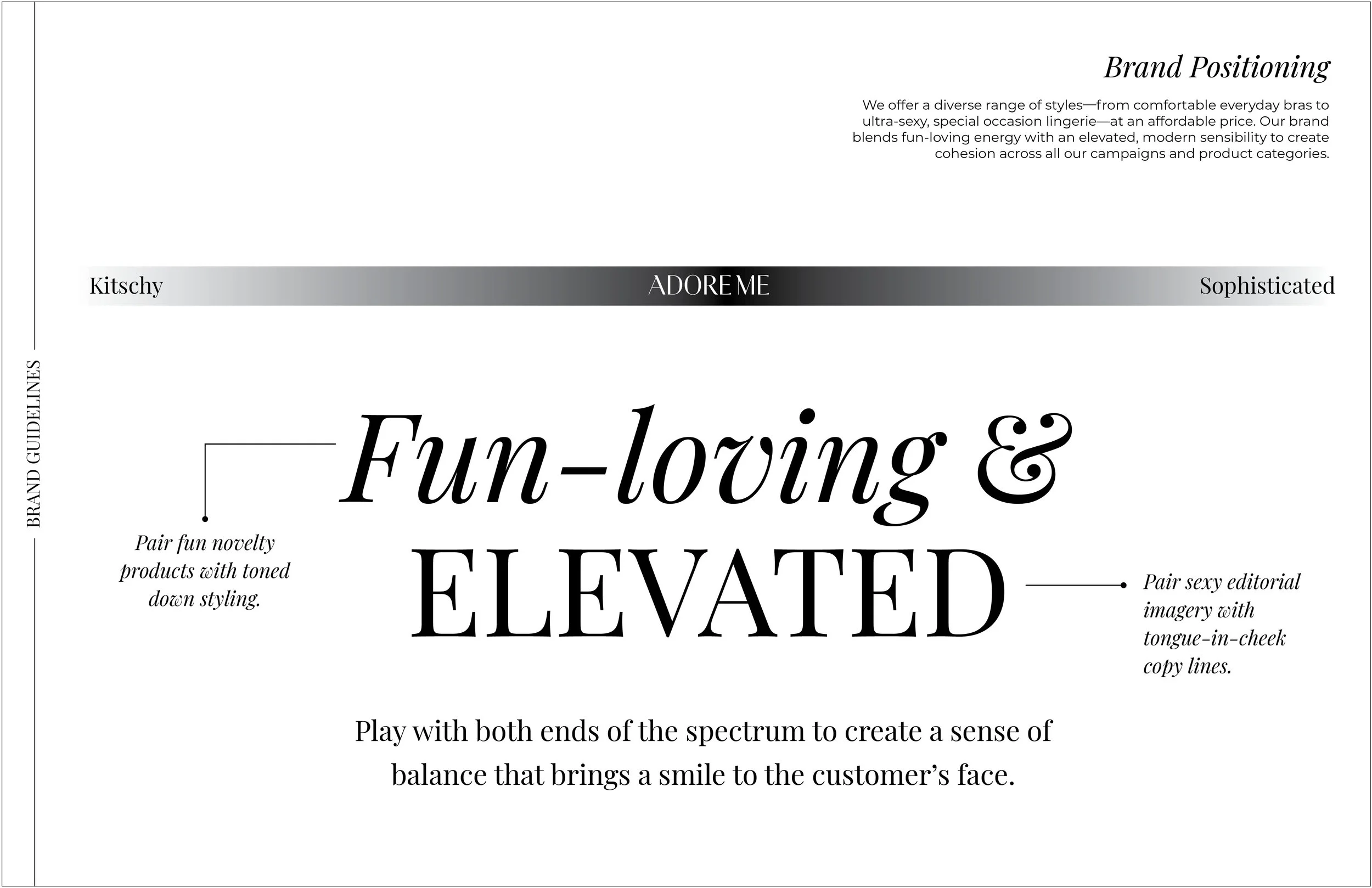


Adore Me Rebrand
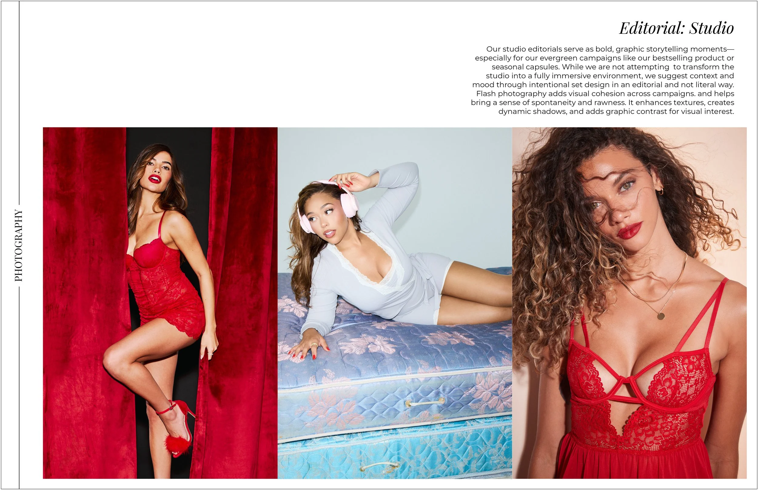
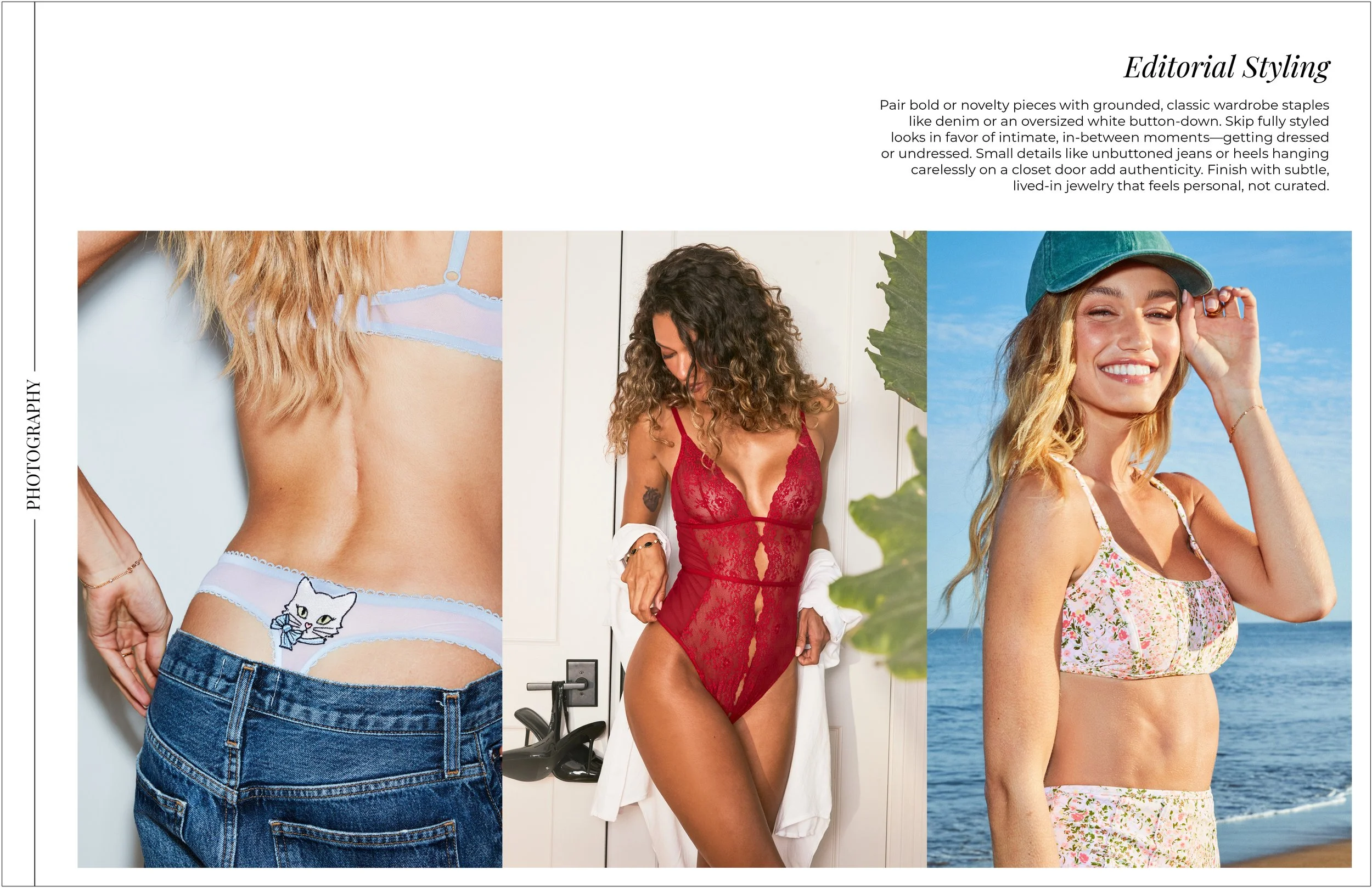
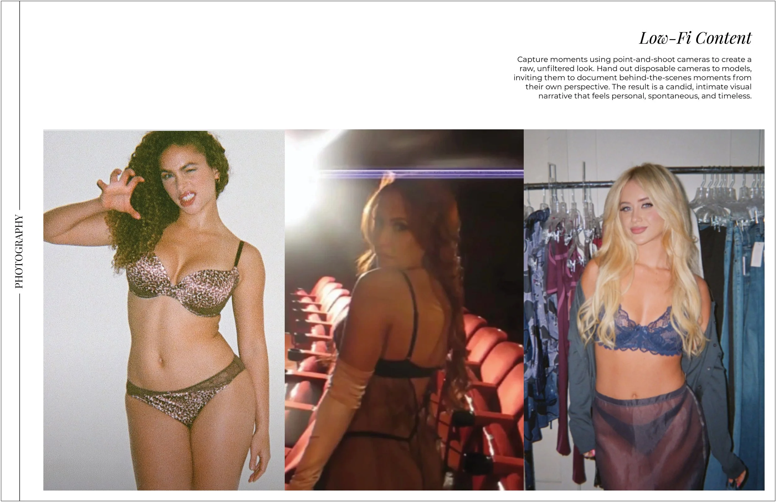
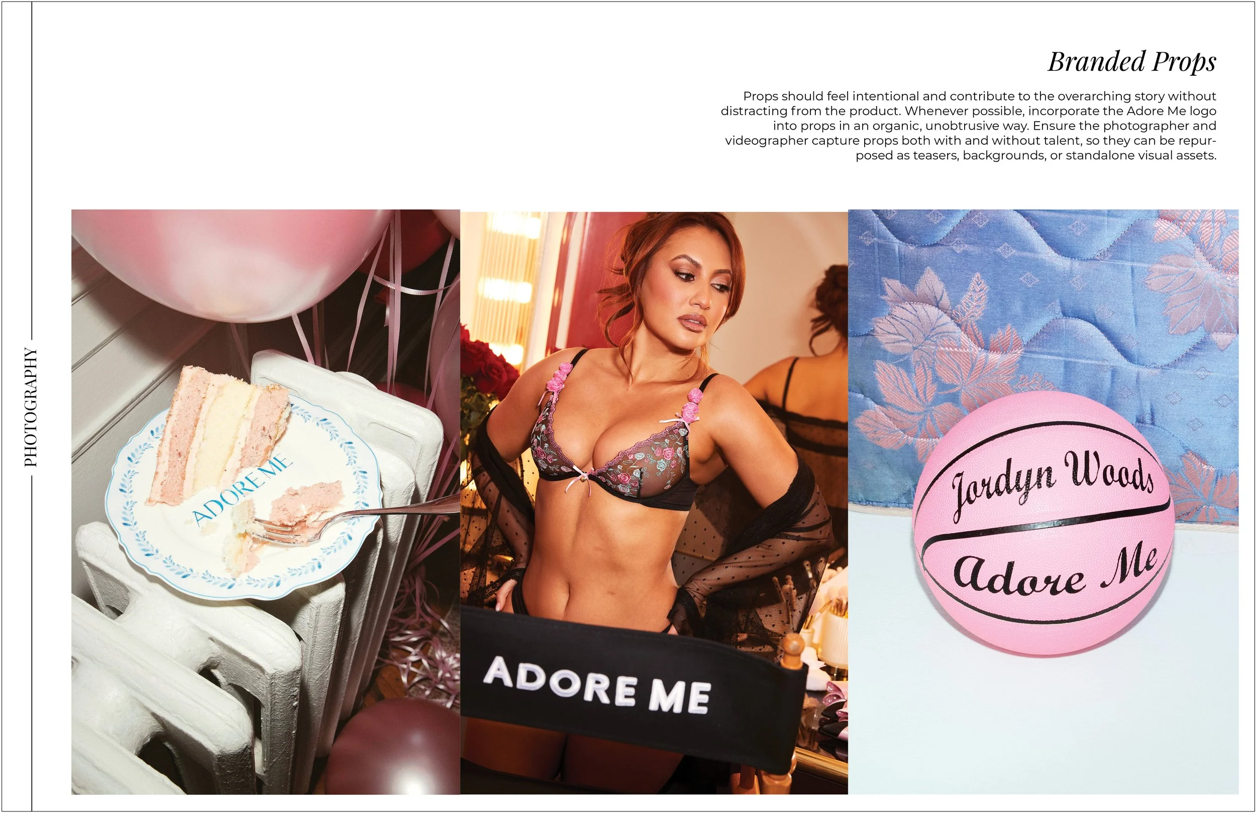
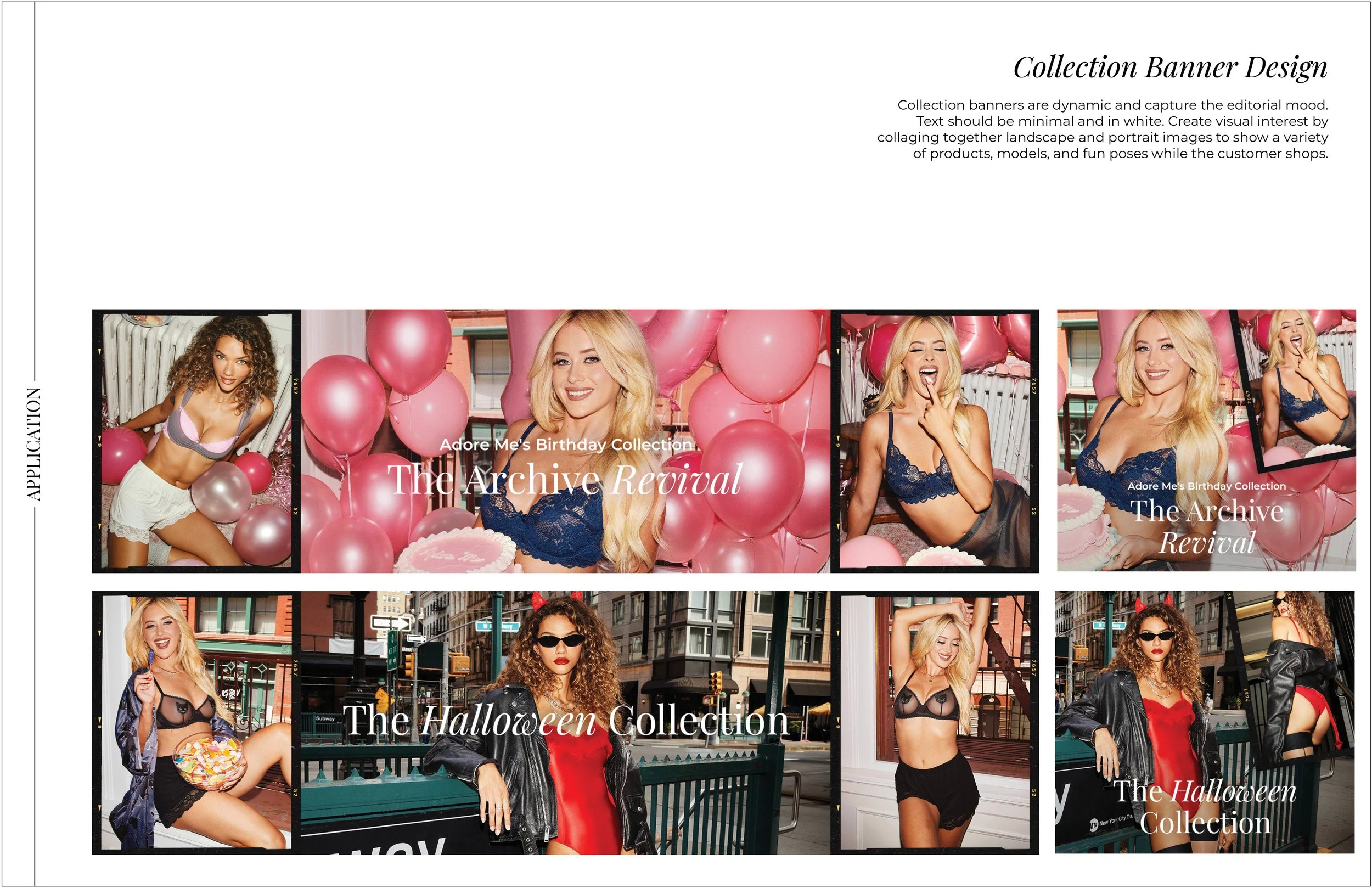
In an effort to create visual cohesion, I collaborated with other creatives and key stakeholders in the company to bring the brand back to basics by balancing playfulness with an elevated aesthetic to reflect our updated positioning. Our editorial imagery was front and center of the rebrand, setting the tone for all content created by other teams. Campaigns should create a mood and the imagery should invite the viewer in, allowing space for interpretation and inspiration. Every creative decision prioritizes storytelling while keeping our products as the focus.
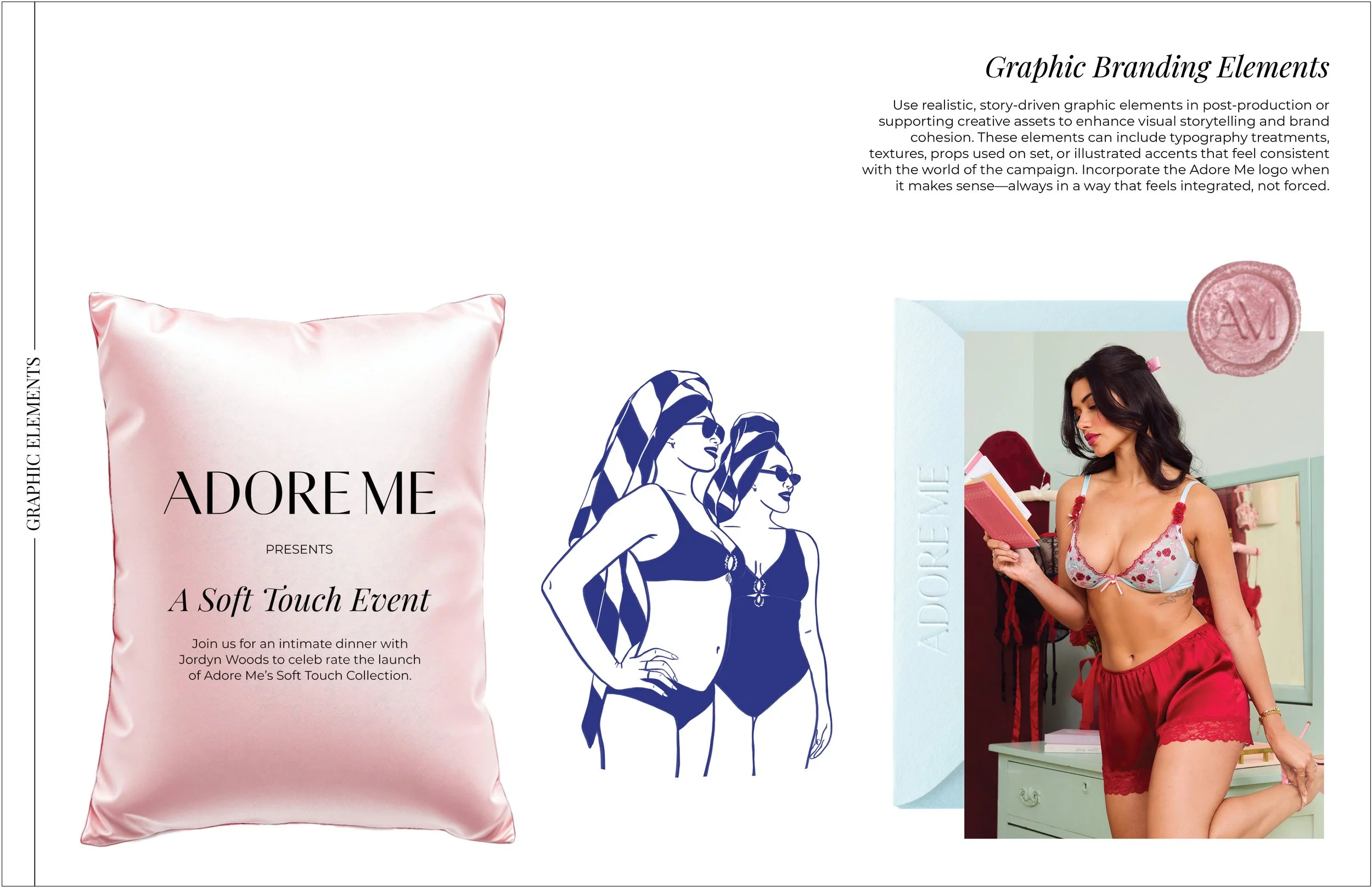
To support this direction, I created graphic guidelines that complement rather than compete with the editorial photography. Rather than relying on color blocks, each campaign was built around a strong, intentional color palette. I also refreshed our typography with Playfair Display—a web-friendly serif that feels both feminine and highly legible.
Once this foundation was established, I was able to push the creative vision further by collaborating with new talent—photographers, stylists, and on-camera personalities—to take the Adore Me’s brand to the next level.